
This tutorial will step you through using aggregation to summarise large amounts of information in reports. This will let you analyse large amounts of information (we're talking hundreds of thousands of rows) in just a few seconds.
It is great for producing summaries like average sales per month, number of customers per year, etc. These summary values are also well suited to graphing.
The important thing to remember about aggregation is that aggregate values will be produced for each unique combination of the other columns. Let's get started!
1. Start with raw values
My goal will be to see monthly values for Total Invoice Amount, and Average Invoice Amount and Total Jobs Completed.
Let's get a report happening without any aggregation first, then later we'll see how to summarise.
I'm going to use the ServiceM8 Jobs data source, but you can do similar with a data source from other connectors if needed. I will choose columns Job #, Date Completed, and Invoice Amount.
When I run it for the past 7 days, I get the following:
| Job # | Date Completed | Invoice Amount |
|---|---|---|
| J136 | 27 Jan 2018 | $280 |
| J137 | 27 Jan 2018 | $44 |
| J138 | 31 Jan 2018 | $1,098 |
| J139 | 2 Feb 2018 | $44 |
| J140 | 4 Feb 2018 | $824 |
| J141 | 22 Mar 2018 | $110 |
If you needed help getting this far, check out our tutorial on designing your first report.
2. Remove unique values
When summarising, aggregation will produce a value for each unique combination of the other columns. This means we need to remove the Job # column, otherwise we'll only get totals per job which isn't too useful!
With the job column gone, I get the following:
| Date Completed | Invoice Amount |
|---|---|
| 27 Jan 2018 | $280 |
| 27 Jan 2018 | $44 |
| 31 Jan 2018 | $1,098 |
| 2 Feb 2018 | $44 |
| 4 Feb 2018 | $824 |
| 22 Mar 2018 | $100 |
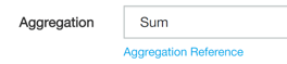
Next, I am going to change the aggregation option for Invoice Amount to Sum and rename the column to Total Invoice Amount.
When running the report, I now get the following:
| Date Completed | Total Invoice Amount |
|---|---|
| 27 Jan 2018 | $324 |
| 31 Jan 2018 | $1,098 |
| 2 Feb 2018 | $44 |
| 4 Feb 2018 | $824 |
| 22 Mar 2018 | $100 |
Notice that there is now only one row for 27 Jan 2018, and the Total Invoice Amount shows 280 + 44 = $324. A good start!
3. Apply a date formula
I'm after a value per month, but am currently seeing a value per day.
To fix this, I'm going to change the value source formula for Date Completed to MONTH([Date Completed]). This will snap each date to the start of the month, giving me a single value per month. I now get the following:
| Date Completed | Total Invoice Amount |
|---|---|
| 1 Jan 2018 | $1422 |
| 1 Feb 2018 | $868 |
| 1 Mar 2018 | $100 |
4. Extra aggregations
I now want to see the Average Invoice Amount and Total Jobs Completed.
To do this I'll add two new formula columns (click Add Formula Column):
- One with title Average Invoice Amount, value source formula [Invoice Amount], aggregation type Average
- One with title Total Jobs Completed, value source formula [Job #], aggregation type Count
I'll also override the number format for Date Completed to show Date (Month and Year).
Here's what I see:
| Date Completed | Total Invoice Amount | Average Invoice Amount | Total Job Count |
|---|---|---|---|
| Jan 2018 | $1422 | $474 | 3 |
| Feb 2018 | $868 | $434 | 2 |
| Mar 2018 | $100 | $100 | 1 |
Excellent!
5. Next steps
I'm quite happy with the figures produced, but here are some things I could do from here:
- Instead of MONTH([Date Completed]), I could have used DATETRIM([Date Completed]) which lets me choose a different aggregation period each time I run the report.
- These values would look great on a graph, I could create a dashlet and place it on a dashboard.
What about seeing the detail?
By aggregating, we have hidden the detail of each individual job row. This is an advantage when dealing with lots of data as the report can be small and fast to produce.
If you need to both see summary totals and be able to drill down into individual rows, the solution is to use row grouping. This method isn't practical for large quantities of information as the report can become very large and slow, and might even fail to render if too large. You need to decide between aggregation and row grouping depending on the quantity of rows involved.